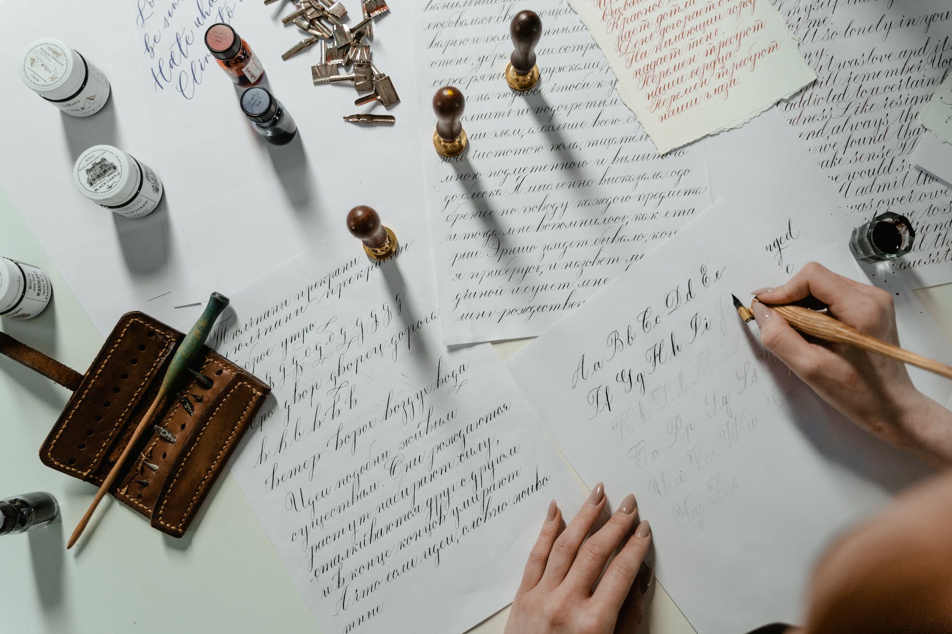
calligraphy and typography, font: combining lettering for visual impact
Fonts play a crucial role in the world of typography and graphic design. Choosing the right typeface and creating effective font combinations can significantly enhance the visual impact of any design or communication. In this article, we will explore the art of calligraphy, the power of typography, and the factors to consider when combining typefaces.
What is Typography and Why is it Important?
The Definition of Typography
Typography refers to the art and technique of arranging typefaces, fonts, and letterforms to create visually engaging compositions. It involves selecting and organizing different fonts, sizes, and spacing to convey a specific message or evoke certain emotions.
The Power of Typography in Design and Communication
Typography has the power to influence how information is perceived and understood. It can set the tone, create a visual hierarchy, and evoke emotions. Effective typography can enhance the overall design and communication by making it more visually pleasing and engaging.
How Typography Impacts Visual Hierarchy
Typography plays a crucial role in establishing visual hierarchy within a design. By using different font sizes, styles, and weights, designers can guide the reader’s eye to important information and create a sense of order and emphasis. It helps prioritize content and enables easier navigation through the text.
How to Choose the Right Fonts
Understanding Font Styles: Serif, Sans Serif, and Display Fonts
Fonts come in various styles, each with its own characteristics and purposes. Serif fonts have small decorative strokes at the end of each letter, giving them a more traditional and formal look. Sans serif fonts, on the other hand, have clean and simple lines, offering a more modern and minimalist aesthetic. Display fonts are decorative and unique, often used for headlines, logos, or promotional materials.
Exploring Different Font Combinations for Various Purposes
When combining fonts, it’s important to consider their compatibility and how they complement each other. Fonts that create contrast can add visual interest, while fonts that share similar characteristics can create a cohesive and harmonious look. Experimenting with different font combinations can help find the perfect pairing for specific purposes.
Tips for Pairing Fonts in Web Design
In web design, choosing appropriate fonts is crucial for readability and user experience. Sans serif fonts are commonly used for body text due to their legibility on screens, while serif fonts can be used for headings or other important elements. It’s also essential to consider the overall style and theme of the website when selecting fonts.
The Art of Calligraphy
Understanding the Basics of Calligraphy
Calligraphy is the art of beautiful and decorative writing. It involves creating letterforms with a brush or pen, often emphasizing a fluid and elegant style. Calligraphy adds a personal and artistic touch to designs, making them visually appealing and unique.
Using Calligraphy in Logo Design
Calligraphy is often used in logo design to evoke a sense of elegance, luxury, or craftsmanship. It can give a brand or product a distinct and memorable identity. Calligraphy logos are especially popular in industries such as fashion, beauty, and luxury goods.
Incorporating Calligraphy in Invitations
Calligraphy is also commonly used in invitations for special events such as weddings or formal gatherings. The delicate and artistic nature of calligraphic lettering adds a sophisticated and personalized touch to event stationery, setting the tone for the occasion.
Factors to Consider When Combining Typefaces
Choosing Fonts that Create Contrast and Complement Each Other
When combining typefaces, it’s important to consider how they create contrast and complement each other. Contrasting fonts can help differentiate between different levels of information, while complementary fonts can create a cohesive and harmonious look. The right combination can enhance the overall visual impact of a design.
The Impact of Serif and Sans Serif Combination
A popular approach to combining typefaces is pairing a serif font with a sans serif font. The contrast between the traditional and modern styles can create visual interest and add depth to the design. This combination is widely used in editorial layouts or for creating a balance between headings and body text.
Mistakes to Avoid When Pairing Fonts
While experimenting with different font combinations, there are some common mistakes to avoid. Using too many fonts can make a design look cluttered and confusing. It’s also important to ensure that the chosen fonts are legible and appropriate for the context in which they are used.
How Many Fonts Should You Use?
Understanding the Number of Fonts that Work Well Together
There is no fixed number of fonts that should be used in a design, as it depends on the context and the desired outcome. However, using too many fonts can create visual chaos and diminish the overall impact. It’s generally recommended to limit font usage to two or three fonts to maintain consistency and coherence.
Experimenting with Different Font Combinations
Don’t be afraid to experiment with different font combinations to find the perfect match for your design. Trying out various styles, sizes, and weights can help you discover unique and visually appealing combinations that suit your project’s requirements.
Tips for Maintaining Consistency in Font Usage
To maintain consistency in font usage, it’s important to establish a set of guidelines for your design project. This includes selecting a primary font for body copy or body text and ensuring that the other fonts used are complementary and consistent with the overall visual style.
