calligraphy and typography: combining lettering for visual impact
Typography is a powerful tool in the world of graphic design. It plays a crucial role in conveying messages and creating a visual impact. The choice of font, typeface, and letterforms can greatly influence how a design is perceived by the audience. In this article, we will explore the art of calligraphy and typography, as well as the different font combinations and pairings that can be used to create stunning visuals.
The Power of Typography in Design
Understanding the Psychology behind Fonts
Fonts aren’t just about aesthetics; they can also evoke certain emotions and convey specific messages. Serif fonts, with their decorative and elegant designs, are often associated with tradition, reliability, and sophistication. On the other hand, sans-serif fonts are clean, modern, and convey a sense of simplicity and efficiency. By understanding the psychological impact of different font styles, designers can choose the right typography to effectively communicate their message.
Exploring the Evolution of Typography
Typography has come a long way since its inception. From traditional calligraphy to the digital fonts we use today, the evolution of typography has been influenced by technological advancements and changing design trends. Gone are the days of hand-drawn lettering; now, designers have a wide array of digital fonts and typefaces to choose from. The world of typography is constantly evolving, and staying updated with the latest trends and techniques is essential for designers.
Creating Visual Hierarchy with Typeface and Font Styles
Typography is not just about choosing a font; it’s also about creating visual hierarchy and guiding the viewer’s attention. Different typefaces and font styles can be used to establish a hierarchy of information in a design. For example, using a bold serif font for headings and a lighter sans-serif font for body text can help create a clear and organized structure. By carefully selecting and pairing fonts, designers can direct the viewer’s gaze and enhance the overall visual impact of their design.
Exploring Font Combinations
Pairing Serif and Sans Serif Fonts for Contrast
One popular technique in typography is combining serif and sans-serif fonts to create contrast and visual interest. The elegance of serif fonts can be balanced with the simplicity of sans-serif fonts, resulting in a harmonious and eye-catching design. This combination can be particularly effective in print materials such as brochures, magazines, and posters.
Combining Calligraphy and Display Fonts for Elegance
Calligraphy fonts, with their intricate and artistic letterforms, can add a touch of elegance and sophistication to any design. When combined with display fonts, which are bold and attention-grabbing, the result is a visually stunning composition. This combination is often used in branding and logo design to convey a sense of luxury and exclusivity.
Choosing the Right Fonts for Logos and Branding
When it comes to logos and branding, the choice of fonts is crucial. Fonts play a significant role in establishing a brand’s visual identity and conveying its values. Whether it’s a sleek and modern sans-serif font for a tech company or a classic and timeless serif font for a luxury brand, the font choice should align with the brand’s personality and target audience. The right font can instantly communicate the essence of a brand and make it memorable.
The Impact of Typography in Web Design
Enhancing User Experience with Chic and Friendly Fonts
In web design, typography has a direct impact on user experience. Fonts that are easy to read and have a friendly and approachable appearance can create a positive impression on users. Chic and modern fonts can give a website a contemporary and trendy look, while still maintaining readability. Carefully selecting the right fonts for web design can significantly enhance the overall user experience.
Understanding the Role of Complementary Fonts in Layouts
Complementary fonts are fonts that work well together and create a cohesive visual experience. In web design, using complementary fonts is key to creating a harmonious layout. For example, pairing a bold headline font with a more subtle and easy-to-read body font can ensure that important information stands out while maintaining readability throughout the page. The choice of complementary fonts can greatly contribute to the overall aesthetic appeal of a website.
The Number of Fonts to Use in Web Design
When it comes to using fonts in web design, less is often more. Using too many different fonts can make a design look cluttered and unprofessional. It is generally recommended to stick to two or three fonts in a web design project. This allows for consistency and cohesiveness throughout the design while still providing enough variety to create visual interest. By carefully selecting and combining fonts, designers can create visually appealing and user-friendly websites.
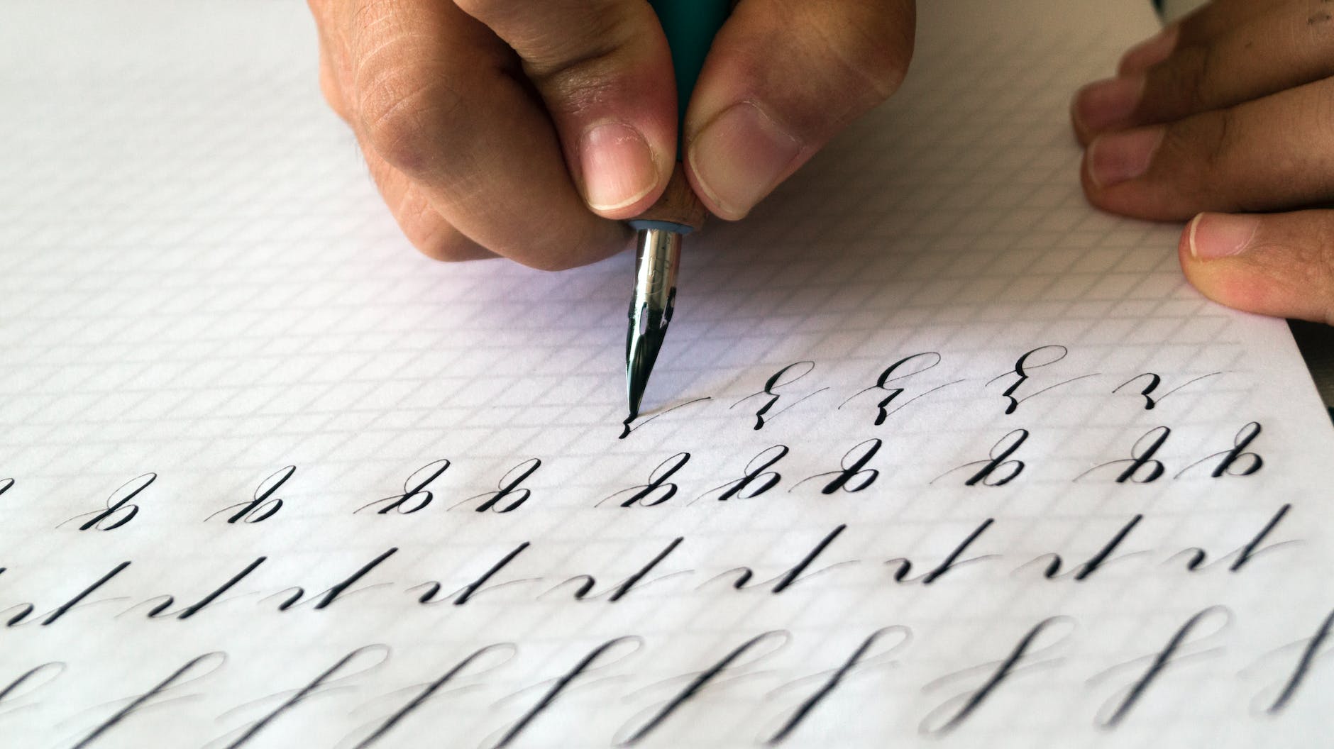
The History and Influence of Calligraphy
Exploring the Origins and Techniques of Calligraphy
Calligraphy has a rich history that dates back centuries. It originated as a form of artistic writing in ancient civilizations and has since evolved into a revered art form. Calligraphy involves precise and deliberate pen strokes to create visually striking letterforms. The techniques and styles vary across different cultures and traditions, each contributing to the beauty and uniqueness of calligraphy as an art form.
Applying Calligraphy in High-End Design and Communication
In the world of design and communication, calligraphy is often associated with high-end and luxurious aesthetics. Its ornate and sophisticated letterforms lend a sense of elegance to any design. Calligraphy is commonly used in invitations, packaging, and other high-end design projects to evoke a sense of exclusivity and class. The use of calligraphy can elevate the visual appeal and communicate a message of elegance and refinement.
Using Calligraphy to Create an Elegant Visual Identity
Calligraphy is an excellent choice for creating an elegant visual identity. Its elaborate and decorative letterforms can make a logo or branding stand out and leave a lasting impression. Whether it’s a luxurious fashion brand or an upscale restaurant, calligraphy can add a touch of sophistication and grace. Using calligraphy strategically in a visual identity can help convey a message of elegance and create a strong brand image.
Fonts That Go Together: Creating Beautiful Type Combinations
Combining Serif and Sans Serif Typefaces for Balance
A classic and timeless combination is pairing serif and sans-serif typefaces. Serif fonts provide a sense of tradition and elegance, while sans-serif fonts bring a modern and clean aesthetic. This combination creates a balanced and visually appealing typography that can be used in various design projects, including print and digital media.
Exploring Different Font Pairings for Decorative Purposes
For more decorative purposes, designers can experiment with different font pairings to create unique and visually striking effects. Combining fonts with contrasting styles, such as a bold and playful display font with a delicate script font, can add interest and personality to a design. It’s important to consider the overall aesthetic and purpose of the design when choosing decorative font pairings.
Choosing Fonts with Compatible Italics and Strokes
When selecting fonts for a design, it’s essential to ensure that the italic and stroke styles are compatible. Font families often include different variations, such as regular, italic, bold, and bold italic. Using fonts with compatible styles allows for consistent and cohesive typography throughout the design. Italic and bold variations can be utilized to emphasize certain elements and create visual hierarchy within the composition.
The Right Font for Every Design Project
Understanding Font Styles for Body Text and Readability
When it comes to body text, readability is key. Choosing the right font style that is easy to read is essential for conveying information effectively. Fonts with a clean and simple design, such as sans-serif fonts, are often preferred for body text as they provide optimal legibility. It’s important to consider factors such as letter spacing and line height to ensure maximum readability.
Exploring Condensed Fonts for Space-Saving Layouts
In some design projects, space may be limited, and condense fonts can be a valuable tool. Condensed fonts have narrower letterforms, allowing more text to fit within a limited space without compromising legibility. This type of font is commonly used in poster designs, banners, and headlines where space-saving is crucial.
Using Typography to Express Elegance and Sophistication
Typography is a powerful means to express elegance and sophistication in design. The choice of font styles and typefaces can instantly elevate the overall aesthetic and create an atmosphere of refinement. Fonts with ornate and decorative letterforms, such as script fonts and serif fonts, are often used to convey elegance and sophistication in various design